| ALL ABOUT COLOR |
 |
| We tend to go long periods of time without thinking of color, it is such a regular and often unremarkable part of our daily lives. If questioned, we know our desk is brown and our keyboard is black, our sister's hair is blonde and our favorite shirt is blue. But these are automatic reactions to the visual world around us. Chances are, if we were asked to describe our blue shirt, or point out the color swatch that most perfectly matches our sister's hair, we would be a bit stumped.
Color is a vital aspect of our existence, and we would certainly notice it were it to suddenly disappear. But most of us know surprisingly little about this phenomenon we experience every day.
|
SUMMARY
In this article, we will discuss the various aspects of color, including:
- Where it comes from and how we see it
- Primary and complimentary colors
- Color identification (Pantone and computer codes)
- Digitally reproducing colors on screen
- Using ink to reproduce color in print
|
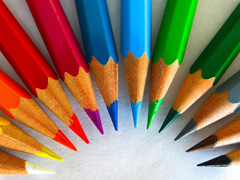
| WHAT IS COLOR?
|
|
|
Color can be described in many ways. It is "the aspect of things caused by different quantities of light", or "the visual perceptual property corresponding to the categories of red, blue, yellow, and more." A wealth of physics-related knowledge is required to fully understand how color is created, changed, and perceived, but for our purposes a simplified definition will suffice.
Color is created by the absorption and reflection of light on a surface. Without light, there is no color, which is why you cannot see or distinguish things in the dark - anyone who has chosen a green shirt with the lights out, only to move into a different room and realize you picked a red shirt has experienced this.
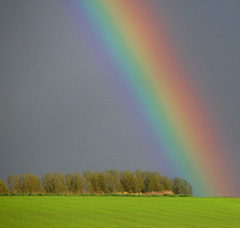
That light that is striking the surface contains every color - the "spectrum" (think of the rainbow colors we learn in grade school: red, orange, yellow, green, blue, indigo, violet). When all colors are mixed together, they become what is called "white light". When this white light strikes an object, some colors are reflected, while others are absorbed. We see whatever color or colors are reflected. Of course, not all light is natural light from the sun, and objects lit by tungsten, fluorescent or halogen lights will absorb and reflect slightly different colors.
So if light strikes a white object, a painted wall for example, the entire spectrum of light is reflected and we see all the colors which, as we just learned, create white. When that same light strikes the blue couch against the wall, all the colors but blue are absorbed. That blue is reflected, and reaches our eyes. When the light hits the black television set in front of the couch, however, every color is absorbed. What we identify as the "color" black is actually the absence of all colors.
Light is made up of electromagnetic waves, and each color has a different wavelength. Without going into too much detail, we can note that the colors Red and Violet have the most widely different wavelengths the human eye can perceive: red is the longest and violet is the shortest. Other colors of light have longer and shorter wavelengths, but are invisible to the naked eye. Therefore they don't fit into our basic discussion of color.
HOW WE SEE COLOR
The human eye consists of three different types of "cones" that contain photo-sensitive pigments. Each cone senses a different part of the light spectrum - the long wavelength of red, the middle wavelength of green, and the short wavelength of blue.
When we see a certain color, the corresponding cone is activated, and sends this information to our optic nerve. The nerves compare how red, green, or blue the color is, and sends this information to our brain. Since a mental comparison is the determining factor of color, it is easy to imagine how arguments over the "true" color of a single object can arise.
COLOR BLINDNESS
Contrary to some beliefs, color blindness is not generally an inability to see all colors, at least in humans. More often, color blind people cannot distinguish between different colors that are relatively close together on the spectrum. This is caused by a defect - usually hereditary - in the cones of the retina that transmit color to the optic nerve.
There are two common types of color blindness. Red-green color blindness (deuteranopia) prevents the person from distinguishing between red and green - the two colors look the same. Similarily, Blue-yellow color blindness (tritanopia) makes it difficult to differentiate between blue and yellow. Some research has suggested that people with difficulty seeing certain colors are actually able to see other colors that non-color blind people cannot.
Monochromacy, or total color blindness, does exist, but is quite rare in mammals.
|
|
| DIFFERENT COLORS, DIFFERENT NAMES
|
|
|
We have all heard of complementary colors and you don't need degree in physics or color theory to recognize that some colors look better together than others. But how are complementary colors determined?
Much like the color receptors in the eye, the color theory of color pigments - essentially paint - begins with three primary colors: red, blue, and yellow. When one of these colors is mixed with another, a secondary color is created. These colors are purple (red and blue), green (blue and yellow), and orange (red and yellow). The third category of basic colors is created by the mixture of these six colors; they are simply named for the mixture, such as blue-green.
Once this color wheel has been established, we can determine the "official" complementary colors. These are colors that are directly across from one another on the wheel. the complementary pairs are red-cyan, green-magenta, and blue-yellow. Complementary colors cancel one another out when mixed (ie: they create black), and are therefore thought to provide the most contrast when placed side by side.
Analogous colors, on the other hand, are any three colors located side by side on the color wheel. When placed in close proximity, they are thought to create arrangements pleasing to the eye.
Nature has disproven the belief that specific colors look "good" and "bad" next to each other, time and again. Though red and green are not considered complementary in color theory, a red flower within a green field can be stunning. Love birds and finches come in every possible combination of color blocks and are very rarely thought of as unattractive.
NAMING AND IDENTIFYING COLORS
A basic color wheel will often show twelve colors, with three varying mixtures between each primary color (yellow - yellow-red - orange - red-yellow - red). But anyone who has looked at a box of crayons, or flipped through a paint catalog knows there are hundreds of color options. They may have strange names that make reference to foreign locales and types of wood, but there is no denying there are more than twelve colors to be had.
The thousands of colors that exist via endless combinations of the most basic shades are cataloged in various ways, and used for both digital and print viewing.
Pantone is one of the most recognizable suppliers of color matching software and tools, and has a library of more than 2000 colors, used by printing companies, and paint and textile manufacturers.
Pantone colors are identified by a unique combination of numbers (usually in a 00-0000 format). The company is known for their creative color names and the selection of a "Color of the Year" since the 1960s.
Though Pantone colors are often used in digital printing, the numerical code they are given is not recognized in most editing and graphic design software. Instead, other color codes are used, which utilize set values for each color in the mode (RGB or CMYK) or a number and letter combination called a hexadecimal code.
For example, a deep wine red may be identified as:
- Pantone: "Chili Pepper" 19-1557
- RGB: Red 131, Green 41, Blue 41
- CMYK: Cyan 30, Magenta 91, Yellow 82, Black 34
- Hex code: #832929
|
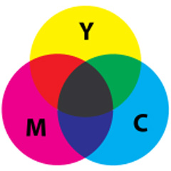
When CMY "primaries" are combined at full strength, the resulting "secondary" mixtures are red, green, and blue. Mixing all three gives an imperfect black or a perfect grey. The complementary pairs are magenta-green, yellow-blue, and cyan-red.

The color that results from the given codes.
|
| DIGITALLY REPRODUCING COLOR
|
|
|
As you can see from the various options for digitally creating a single color, there is a lot of room for mistakes. When matching a color in one digital image to a color in another, the solution is quite simple. Most software has a tool called the "eyedropper", which selects a color from an image and automatically translates it into the correct code.
There are even many websites available that will translate all the colors on a given web page into their individual color codes. This is useful when designing logos or coloring a blog or newsletter in a brand's official colors.
However, when a digital image is to be printed, the margin for error expands considerably. For one thing, our eyes see color very differently on a backlit computer screen and printed on a piece of smooth white paper. Colors also appear to change when move from viewing an object or image outside in natural light, to indoors in the fluorescent glow of the office.
Additionally, our eyes register color differently than a camera or scanner, and this becomes an issue in art reproduction. Even if our computer screen is calibrated to show an image exactly as we would see it on paper, the digital reproduction might not exactly match the physical original.
This is where the designer or print technician comes it. It is their job to ensure the color they see on the screen is as close to the color of the original as possible. This process is called Color Matching, and you can read more about it in our article on color matching in art reproduction.
The final area where digital and so-called "physical" color come into play is when the image is sent to the printer and printed on a substrate - paper, canvas, or even fabric or plastic. Different substrates have different established profiles that alter a digital image so that the print will mimic it as much as possible, but hard proofs or test strips are still produced prior to printing the full image.
The technician will compare these test strips to the original and alter the digital file if the yellows appear too white, or the image tone appears too blue.
|
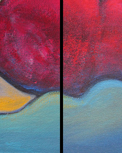
The result of a good color match.
Left: Original; Right: Print
|
| HOW PRINTER INK CREATES COLORS
|
|
|
The ICC profile that determines the way colors will be produced by the printer needs to take into consideration the inks that are being used. Most large format, high quality ink jet printers, the kind that are used for creating Giclée canvas and fine art paper prints, use anywhere from 6 to 12 ink cartridges in various basic colors that will be blended to create the - most likely - hundreds of colors in the printed image.
The ink cartridges will have different colors depending on the number of cartridges the printer holds. Often, multiple cartridges are filled with black or shades of gray, since this color is used often. To make this description easier, I will refer to the printer and inks we use here at KeenART Media.
Our Epson Stylus Pro 11880 printer holds nine ink cartridges in the following colors:
- Photo black
- Matte black
- Light black (a dark gray)
- Light light black (a light gray)
- Cyan
- Light cyan
- Vivid magenta
- Vivid light magenta
- Yellow
An ink jet printer works by spraying tiny dots of color onto the substrate that passes below its moving head. Depending on the resolution of the digital image being printed, in one square inch of color there can be as many as 2880 little dots. This number is called the dpi, or dots per inch, and in the digital image it is called ppi, or pixels per inch. Generally, we choose convert image files to 300 dpi because this produces a very high quality image that is still small enough to work with easily within the editing software (the more pixels, the longer every action takes).
As amazing as it may seem, just variations of the colors listed above can create essentially every color imaginable. Slightly more or less cyan in a mixture of yellow and vivid magenta can produce radically different gradations of a basic color, to produce the subtle shifts of a sunset or a span of dew-specked grass. The cartridge colors mix together within the printer based on what colors in the light spectrum they can absorb. The resulting color is the one color all those mixed colors reflect.
You may have noticed there is no white ink. This is the case for most inkjet printers and it means where true white appears in the digital image, no color is printed at all. This is one way images printed on different paper can vary unavoidably, no matter how precise the color profile might have been.
|
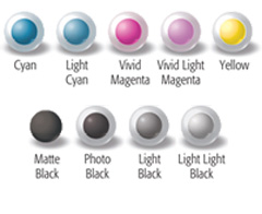
The nine colors used some printers.
|
| This may be more information than anyone ever wanted to know about color and how it is used to create stunning prints that are virtually indistinguishable from the original painting or drawing. In the end, you always have the option to leave all the denser details up to our talented print technicians at KeenART Media. All you need to provide is the photograph or original artwork, and we can do the rest.
If you have any questions about the printing process for creating Giclée prints or how we will guarantee the best color match possible, do not hesitate to contact us. Our friendly and knowledgeable staff are always happy to help you get exactly the product you are looking for.
|
|

|


|
USA Giclee On Canvas, Fine Art Printing - Art Scanning & Reproductions - Handmade Oil Paintings - Custom Wood Panels, Metal Picture Framing - Block/Plaque Mountings, Large Format Dry Mounting & Lamination - Art Supplies: Stretcher Bars, Cradled Wood Panels and Artist Canvas - Collages On Canvas - Plexi/Acrylic Face Mounts - Block Acrylics, Fabric Printing, Dye Sublimation - Cityscape Skyline Prints, Resin, Photo Gifts and more...
Frame Assembly Guide - Dovetail System
USA Laser Engraving & Cutting Services
|
|
© 2002-2024 - KeenART Media Ltd.
|
|
| |
|